Consistency in branding creates unity across our channels, building our reputation and brand integrity. These resources will provide direction for creating materials with cohesive branding to be used across all channels for use by Sports & Rec staff.
Please direct questions and requests for usage or approval of any of the brand elements to KPE Communications.
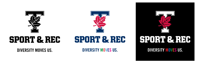
Sport & Rec Logo
Diversity Moves Us is our equity-based tagline. It is representative of our commitment to diversity and creating an inclusive environment across all program offerings. A logo-tagline lock-up has been created and can be found here, and should not be altered in any way (ie. colour, or size distortion).
The tagline may be used as a separate element on media where the combined logo would appear too small. It should be paired with our website where possible. To reduce clutter, the tagline will generally not be used with co-branded initiatives, unless it is diversity-focused.
To request the logos in another format or at a higher resolution, please contact KPE Communications.
Logo Safe Usage
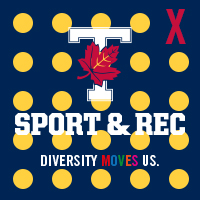
The logo cannot be on top of a patterned or busy background because it interferes with the legibility of the text.
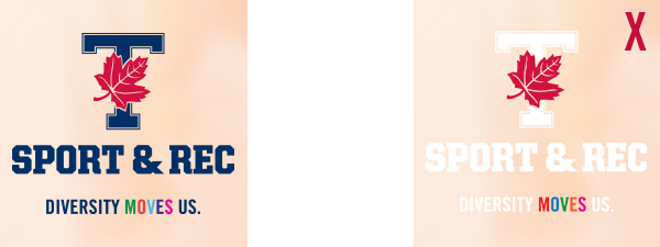
Please also ensure that there is enough clear space surrounding the logo. We recommend a safe zone around the logo about the same size proportionate to the “S” in “Sport and Rec”, as per the red marks around the logo below.
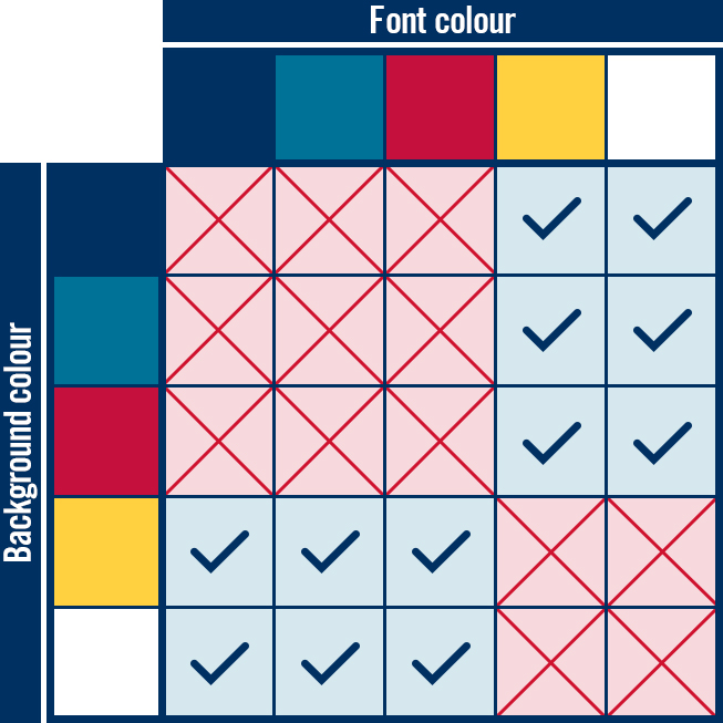
Colour contrast must also be considered when using a logo. If you have a dark background, the white logo can be used to create higher contrast, and a lighter background should use the standard navy logo. The colour guide further down this page further explains colour contrast compatibility within our pallet. Below is an example of good contrast on a light background, versus an example where there is not enough contrast.
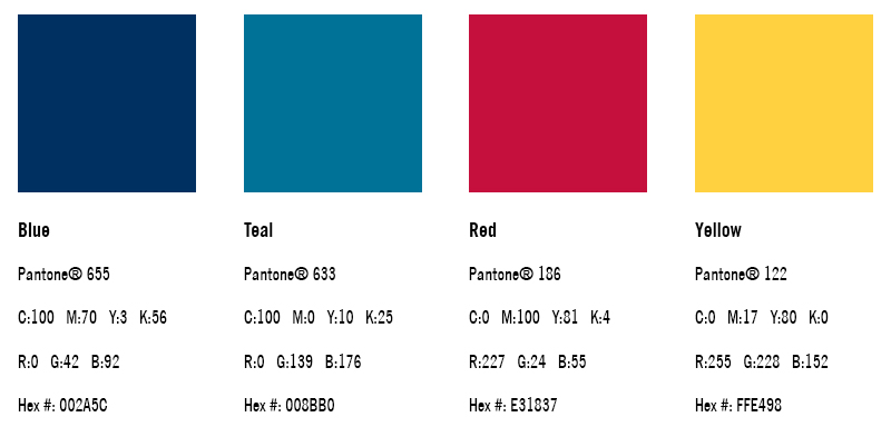
Colour Palette
The S&R colour palette is firmly rooted in University of Toronto’s official colour, Pantone® 655 (dark blue). Red, teal and yellow are also leveraged as secondary colours, specifically with the values listed below.
In order to comply with the Accessiblity for Ontarians with Disabilities Act (AODA), please ensure strong contrast when using colours as outlined in the image below.
Typography
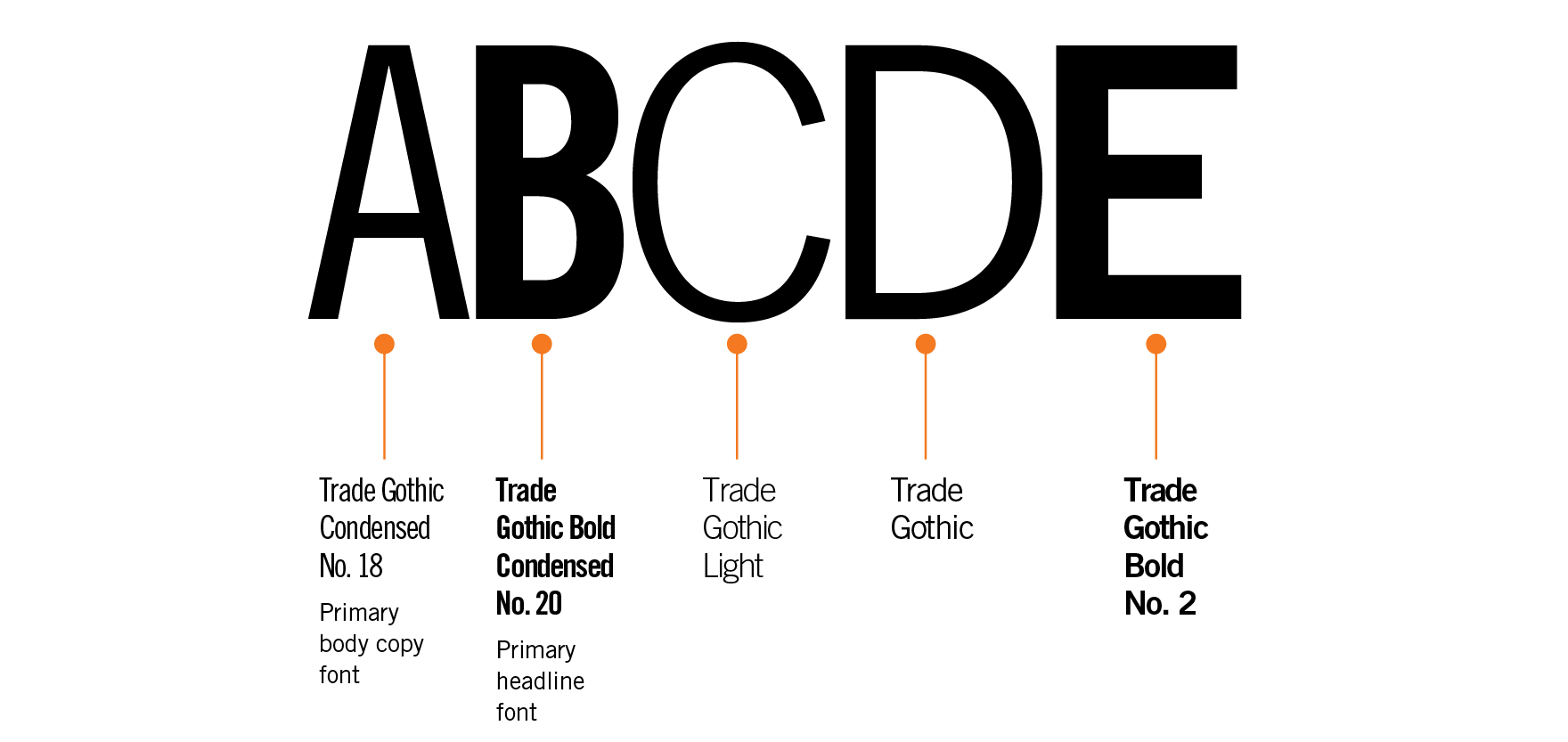
In accordance with the University of Toronto's visual identity guidelines, the official typeface for KPE is Trade Gothic. Bembo is the secondary font but should only be used sparingly for body text only.
In the case that Trade Gothic is not available (e.g. inter-office documents, email signatures, PPT slides, etc.), please substitute Arial Narrow or Helvetica Medium Condensed. Trade Gothic is typically used for headlines, titles and signage.
If Bembo is not available, Times New Roman should be substituted for body copy.
Tagline
S&R's tagline is "Find your ____.", where the blank may be adapted to promote a specific activity/program (e.g. Find your strength, Find your team, Find your skill). By default and where applicable, the tagline is "Find your fit."

Email Signature
Please click here to download the email template.
Questions and Requests
Please direct questions and requests for usage or approval of any of the brand elements to KPE Communications.