
This fall, the Faculty of Kinesiology & Physical Education (KPE) at the University of Toronto will start telling its story in a bold new way.
Following 10 months of research and consultation with students, staff, alumni and faculty members, KPE will launch its new academic brand platform. Developed with the goal of more cohesively expressing the vision, values and experiences that characterize the Faculty, the platform is built around a bold tagline: ‘How we Move’.
These three words aim to convey the ethos and energy of the students, programs and researchers at KPE. Grounded in the Faculty’s multidisciplinary lenses, the tagline can refer to the biophysical and mechanical qualities of movement. It also refers to the faculty’s physical cultural and behavioural lenses of focus, such as moving the needle on policy or moving public understanding and behaviour of physical activity.
“The Faculty of Kinesiology & Physical Education has seen a lot of growth and change in the last decade and not only does this brand platform reflect who we are, it speaks to where we’re headed,” said Ashley Stirling, vice-dean, academic affairs. “It also gives us an opportunity to showcase our strengths as one of the top-ranked kinesiology programs in the world by sharing the amazing stories and experiences that we hear about regularly from our researchers, students and staff. Bringing those stories to the forefront in a consistent and compelling way will strengthen our reputation and ensure that we continue to attract the best from around the world.”
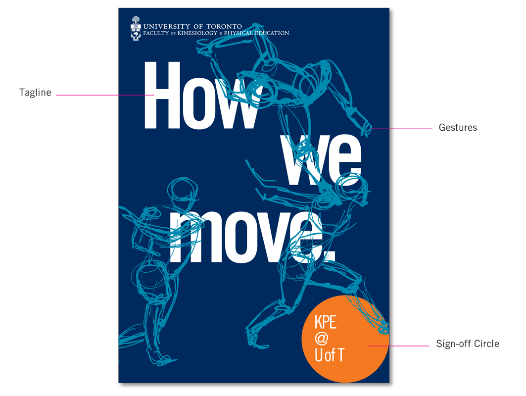 Building upon the University of Toronto’s existing visual identity, KPE’s academic branding incorporates some new elements, including an orange sign-off circle. The orange circle was intentionally chosen as a symbol of wholeness and inclusion: circles carry great meaning in Indigenous culture, e.g. the medicine wheel, healing circles, etc. Complementary to the University’s trademark blue, orange is also a colour associated with enthusiasm, creativity, stimulation, determination and success: all values associated with KPE.
Bright, positive imagery will support the brand, along with a graphic element called gestures—quickly-sketched studies of human figures in motion. The gestures capture the energetic and driven nature of KPE, with the somewhat undefined style alluding to possibilities and the future-focused aspects of the faculty’s work.
Over the next while, the brand will begin to come alive across the Faculty, through print and digital communications, as well as in physical spaces in KPE’s buildings.
“There’s so much about KPE that is innovative, unique, and energizing,” said Ira Jacobs, dean of the Faculty. “Our academic brand platform will be integral to conveying the dynamism and creativity that characterizes the Faculty—today and well into the future.”